

I went with the Sherwin Williams Tidewater although I had it mixed at Benjamin Moore. Instead of using white for the ceiling - I saw a suggestion on-line - to use a lighter shade that coordinated with the wall color so I used the pale blue called glimmer on the same paint sample card as the Tidewater.
 |
| BEFORE |
 |
| AFTER |

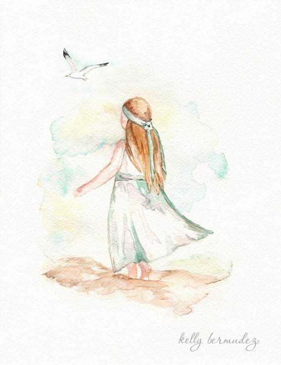
The beach print on the wall here is from a Etsy seller called Kelly Bermudez. Here is the photo from her Etsy listing and the link to her nautical beach section on Etsy https://www.etsy.com/shop/kellybermudez?section_id=11927539

Check out her shop for this and other reasonably priced reproductions of her original artwork.
I love her art work and I was blessed to have won this piece in a giveaway she hosted some time ago. I just recently got the frame for it at Home Goods but I still plan to take it to Michael's to have them add a turquoise matting.
I had purchased a shower curtain which you can see in the before blog post but it was a somewhat busier print. When I bought my towels I found this shower curtain which I just had to have.
I purchased both of these at home goods.

I need to come up with some ideas for these two walls -- I saw some interesting rectangular mirrors for the long wall at Home Goods which would look nice and I'd like to also find or make some kind of shelf - to put seashell or driftwood on.

Whether you love or hate what I've done, I'd love to hear from you - please share your ideas for finishing touches. I plan to paint the brown cabinets also but can't decide what color to do them or how to do it so I'm all ears for suggestions.
The paint color looks nice with the tile.
ReplyDeleteNicely done, I love the color of paint you used, Judy. Did you ever decide what you wanted to do with the tile? A nice, light neutral color on those cabinets would look great. I need to post my bathroom makeover blog too. Looks like we both struck gold at the Home Good store.
ReplyDeleteI love Home Goods Lorrie -- I think I'm leaving the tile alone unless I find the money one day to replace it. Actually, I think it's not so bad with the blue - now that it's done. I was going to try for the cabinets to match the picture frame which is a tan/canvas color -- then I was thinking about a driftwood finish -- which is probably beyond my skill level so I might go with a white.
DeleteJudy, so far it looks fantastic, and the tiles don't look bad with this tone.
ReplyDeleteFor your cabinets I have two ideas: 1) Paint them two shades darker than Tidewater (SW6480 Blue Lagoon but paint the reveal a metallic copper or 2) Paint the whole thing metallic copper.
I like the idea of the shelf with a seashell of driftwood.
Hmmm I'll have to think about the darker shade. Not sure about copper. I do have a sample of the Drizzle which is one down from the Tidewater so I could get an idea from that. Thanks for the ideas.
DeleteLove the light green with Kelly's print and the tile. Good job!
ReplyDeleteIt's always fun to win something! I really like the shower curtain you ended up going with. It's a nice color and a nice design.
ReplyDeleteOnce you paint the cupboards the same color as the wall - your walls will look all uniform and the room much larger and lighter.
ReplyDeleteYou know someone else was suggesting that I use the same color as the walls -- not even a shade darker saying that same thing.
Delete